A voice in the type
Letterforms do more than carry words. A change in scale, weight or spacing can create a different emphasis, suggesting where a reader begins and what they notice next.
Editorial design · typography · visual narratives
OBSERVATIONS / VOL. 01An independent exploration of how words, images and the space between them can turn information into an engaging reading experience.
Read the thinking ↘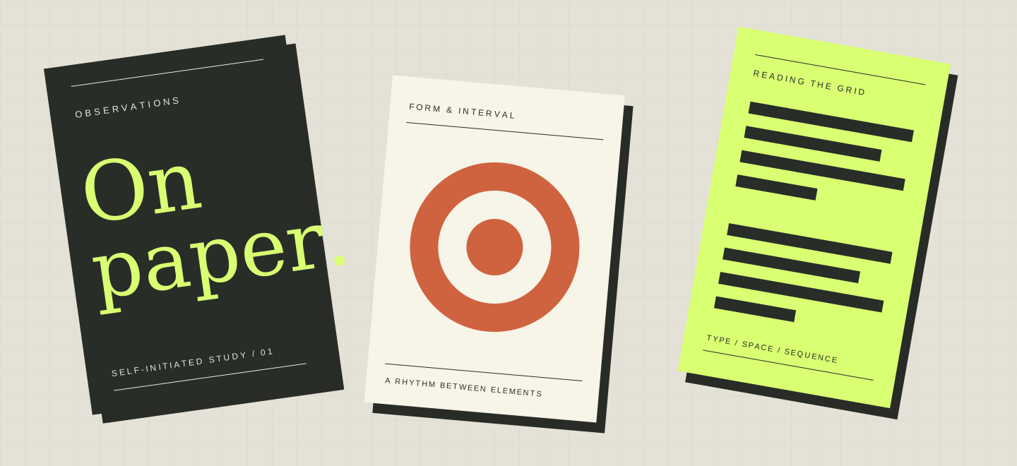
The page as a place
Letterforms do more than carry words. A change in scale, weight or spacing can create a different emphasis, suggesting where a reader begins and what they notice next.
A page grid can bring related elements together while leaving space for a pause. These studies explore how a clear underlying structure supports a varied visual rhythm.
A publication unfolds over time. The relationship between an opening, a detail and the next page can shape the pace of reading, just as much as an individual cover.
About Obsyria
Obsyria is an independent editorial concept and visual research project. It brings together self-initiated explorations of publication covers, typographic hierarchy and the way a sequence of pages can express an idea.
The work begins with questions about reading: what should stand out, what should connect and where a little space might make the whole clearer.
The publications shown here are original illustrative concepts. They are not published books, commissioned client work or claims of registered design credentials.
Continue the conversation
Questions about the project and its visual studies are welcome.